Difference between revisions of "Getting Started"
m (→Adding Decals) |
|||
| Line 543: | Line 543: | ||
== Viewing in ''Photo Studio'' == | == Viewing in ''Photo Studio'' == | ||
| + | |||
| + | <br /> | ||
So, what will this bird look like in Flight? To really find that out, you need to add a motor first. | So, what will this bird look like in Flight? To really find that out, you need to add a motor first. | ||
| Line 564: | Line 566: | ||
=== Flying in ''Photo Studio'' === | === Flying in ''Photo Studio'' === | ||
| + | |||
| + | <table class="left"> | ||
| + | <tr> | ||
| + | <th>Open ''Photo Studio''</th> | ||
| + | <td>Are you ready to see your rocket fly? The, open ''Photo Studio''.<br /><br />'''[[File:12.12.01.Rocket_Build Photo_Studio.png|left|frameless|1028 px|center]]'''</td> | ||
| + | </tr> | ||
| + | <tr> | ||
| + | <th>''Select a Rocket Motor''</th> | ||
| + | <td><br />Here it is.<br /><br />'''[[File:12.12.02.Rocket_Build Photo_Studio.png|left|frameless|1080 px|center]]'''</td> | ||
| + | </tr> | ||
| + | <tr> | ||
| + | <th>''Flame'' Effect</th> | ||
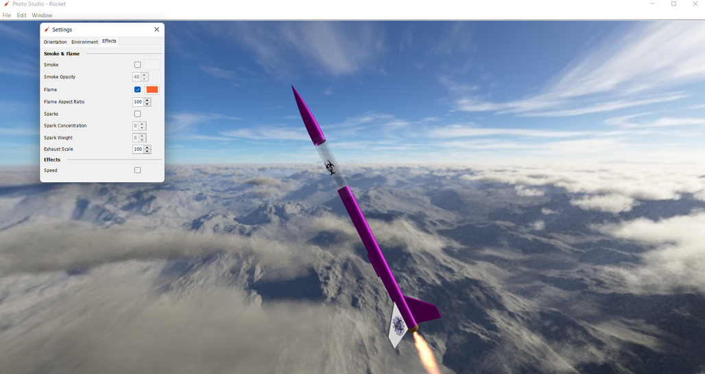
| + | <td><br />So why did you need a motor? Because, '''you can't create flames without it'''.<br /><br />'''[[File:12.12.03.Rocket_Build Photo_Studio.png|left|frameless|1028 px|center]]'''</td> | ||
| + | </tr> | ||
| + | </table> | ||
| + | |||
| + | |||
| + | Now, experiment to your heart's content. | ||
<br /> | <br /> | ||
Revision as of 06:36, 6 April 2022
|
The current User's Guide is very much a work in progress, any help would be greatly appreciated! |
In this section we have a look at how OpenRocket is organized, by analyzing in detail the structure of the user interface. We will also briefly mention the Example projects that are accessible from the File menu. After reading this section you will have a thorough understanding of how OpenRocket is structured, and will be ready to start designing a rocket of your own. If you already know how this program is organized, feel free to jump to Basic Rocket Design, the next section.
The User interface
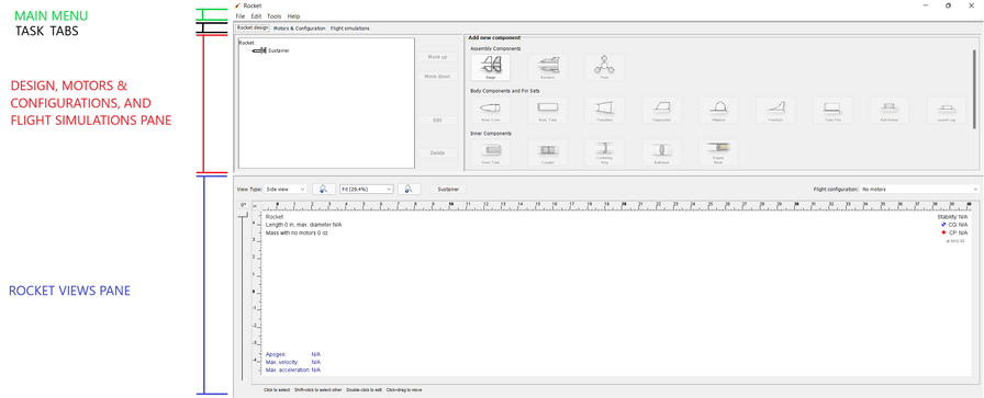
The OpenRocket user interface is divided horizontally into four sections, the Main Menu (green); the Task Tabs (black); the Rocket Design, Motors & Configuration, and Flight Simulation Pane (red), and the Rocket Views Pane (blue).
Main Menu
| Menu Item | Description | |
|---|---|---|
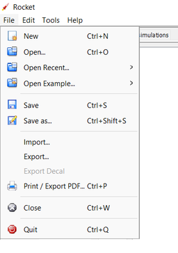
| File | The File Menu is divided into five divisions by function, (1) file opening options; (2) file saving options; (3) import and export options; and (4) closing and (5) quiting options.
|
|
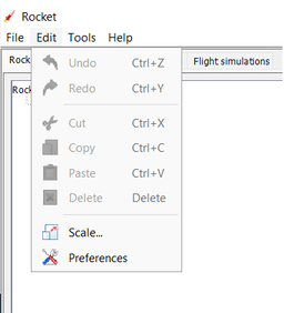
| Edit | The Edit Menu is divided into three types of operations, (1) undoing and redoing an action; (2) cutting, copying, pasting, and deleting components and text; and scaling the rocket and system preference. | |
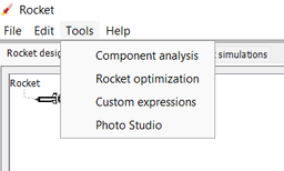
| Tools | The Tools Menu provides design tools which allow the user to analyze the effect of specific components, optimize particular rocket characteristics, create custom expressions for specialized to analysis, and a photo studio which displays the rocket in 3D with a variety of backgrounds and effects. | |
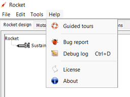
| Help | The Help Menu is divided into three sections, (1) guided tours demonstrating the use of OpenRocket; (2) bug reporting and debugging tools to assist users provide feedback to the developers; and (3) licensing and version and other general information about OpenRocket. |
Task Tabs
The windows shown below utilize the A simple model rocket example included with OpenRocket.
| Rocket Design | |
|---|---|
| The Rocket Design tab is divided into three sections, the component tree, component arrangement buttons, and component selection buttons. The components available in OpenRocket are divided into four classes based upon component function. These classes are assembly components, body components and fin sets (external components), internal components, and mass components (which include electronics and recovery components). Components are greyed out until it would be appropriate to add that component type. As components are added, you will see the component tree (on the left side of the window, grow with each component added. For a detailed description of each component, see Component Details. |
|
| Motors & Configuration | |
| The Motors & Configurations tab is where you select motors, recovery events, and stage timing. Motor configuration options include creating new configurations, renaming existing configurations, removing (deleting) configurations, and copying configurations. With a specific configuration selected, you may select (or select a different) motor, remove the motor, or select and reset the motor ignition timing. For more motors and configuration utilization details, see Motors & Configuration Details. |
|
| Flight Simulations | |
| The Flight Simulations tab is where you manage and flight simulations and flight simulation plots. From here, you can add new simulations, or edit, run, or delete existing simulations. Select a single simulation, and you can even plot and export the simulation results. For more details on ow to use these functions, see Flight Simulations Details. |
Rocket Views
The windows shown below utilize the A simple model rocket example included with OpenRocket.
| The Side View and Back View are line drawings, similar to a blueprint that shows all of the rocket components and the placement of those components. Almost all of your design work will take place in the side and back views. | |
| Side/Back View | |
The 3D Figure and 3D Unfinished view allow you to look through the rockets exterior to view many of the interior components. These views can help you more clearly see the relationship between the placement of different components inside the airframe. |
|
| 3D Figure/3D Unfinished | |
The 3D Finished view shows you what the rocket will look like when finished. OpenRocket allows you to select component colors, inside and outside of outer tubes, right side or left side of fins, and even creating transparent components, all with or without decals (transparent or opaque). |
|
| 3D Finished |
Become Familiar with OpenRocket
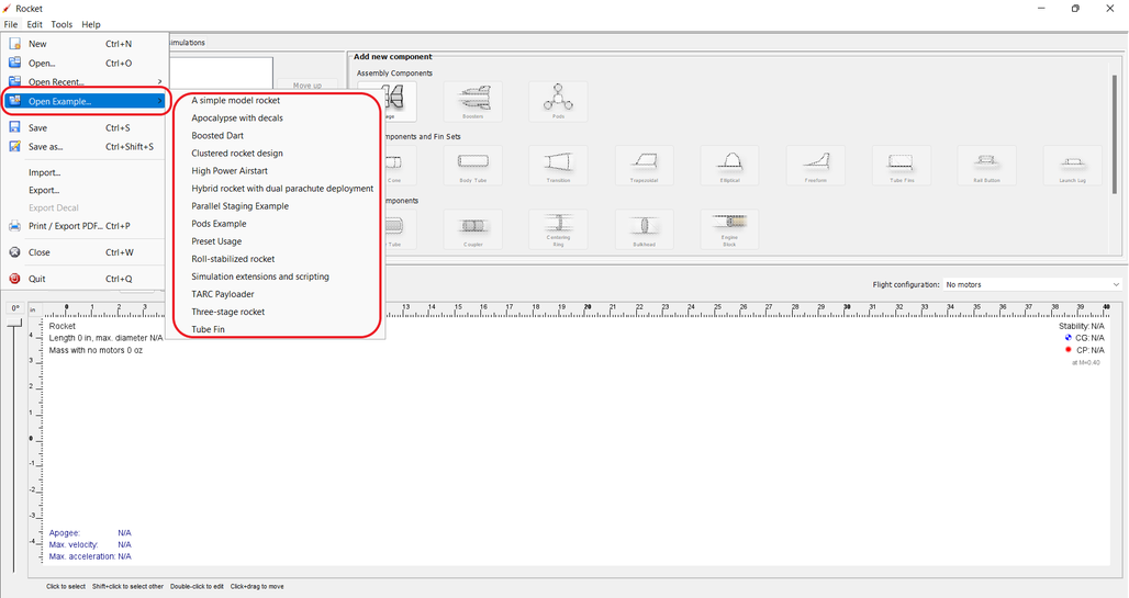
For new users of OpenRocket, before attempting to create your own custom rocket design, it is strongly recommended that you become familiar with the OpenRocket user interface and generally accepted rocket design principles by opening and looking at how an example is assembled, making changes to the example, and understanding how to simulate flights. The example designs are found here:
| File → Example... → |
|---|
The Basics of Using OpenRocket
Rocket Configuration
To build your first rocket, start OpenRocket, then double click the Rocket label at the top of the component tree to open the Rocket configuration pop-up window. OpenRocket allows you to name your design, identify the designer, make comments, and create a revision history.
The default design name is Rocket, but that name can be changed, and a design name change also changes the name of the rocket shown on the component tree. So, rename your design and enter the designer, comments, and revision history information you desire.
| Double-Click Rocket | |
|---|---|
| Rename Rocket |
← Go to Become Familiar with OpenRocket
Adding External Components
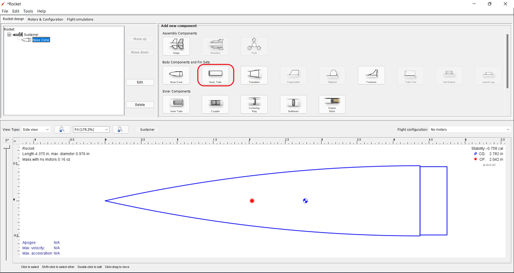
Now it's time to start putting together components to build the rocket design. The generally accepted way of putting together a rocket design is from top to bottom, from nose to tail. So, we'll add the nose cone first.
Selecting a Nose Cone
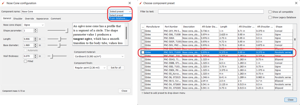
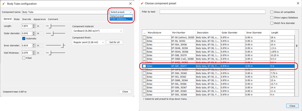
With the Stage selected, click on the Nose Cone button and the Nose Cone configuration window will pop up. Then, select From database... to open the Choose component present window. From here, you can select from the pre-loaded parts database. Select the nose cone shown below, and click the Close button, then close the Nose Cone configuration window.
| Selecting a Nose Cone | |
|---|---|
| Nose Cone Added |
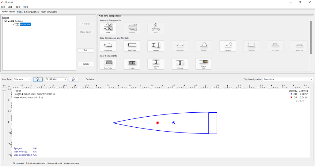
Congratulations, you've just added your first component.
Adding a Payload Bay
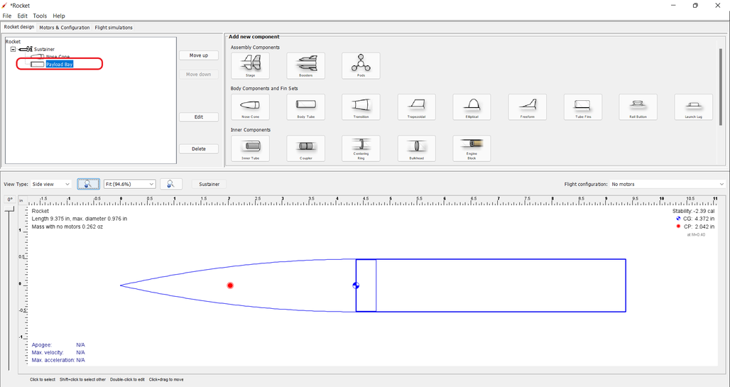
So that a few "appearance" can be demonstrated later, a payload bay will be added after the nose cone. To do this, with either the Stageor Nose Cone selected, click on the Body Tube button and the Body Tube configuration window will pop up. Then, select From database... to open the Choose component present window. From here, you can select from the pre-loaded parts database. Select the body tube shown below, and click the Close button, then close the Body Tube configuration window.
| Add a Body Tube | |
|---|---|
| Payload Bay Added |
Adding a Transition
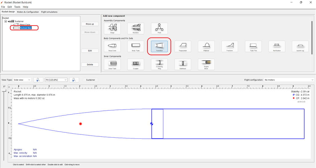
Transitions are most often used to connect body tubes with different diameters. But, a transition can also be used to connect two body tubes of the same diameter, as will be done here.
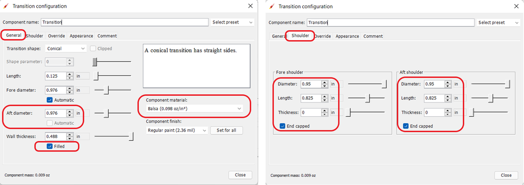
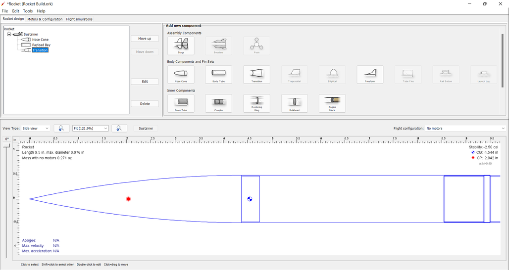
To do this, with either the Stage or Payload Bay selected, click on the Transition button and the Transition configuration window will pop up. The default Transition Configuration tab is the General tab. On this tab, change your entries in the circled areas below to match the entries shown. Then, click the Shoulder tab, and change your entries in the circled areas below to match the entries shown. Then, click the Close button.
| Add a Transition | |
|---|---|
| Change Specifications | |
| Transition Added |
Adding a Body Tube
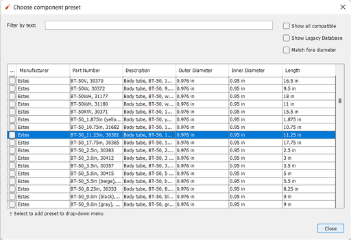
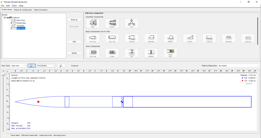
Now, do what you did to add the Payload Bay, above, but select this body tube from the parts database:
| Add a Body Tube | |
|---|---|
| Body Tube Added |
Adding Fins
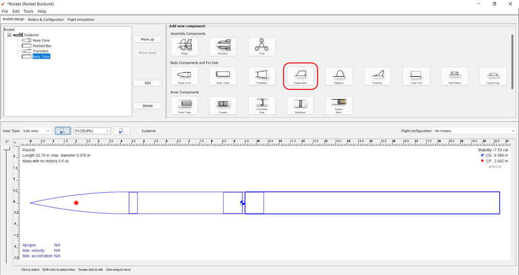
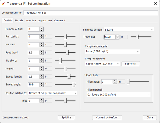
The bottom component are the fins. OpenRocket offers four types of fins, Trapezoidal, Elliptical, Free Form, and Tube Fins. For this design, Trapezoidal fins will be used.
With the Body Tube selected, click on the Trapezoidal fins button and the Trapezoidal Fin Set configuration window will pop up. On your default General tab, change your entries match the entries shown. Then, click click the Close button.
| Select Fin Type | |
|---|---|
| Select Fin Type |
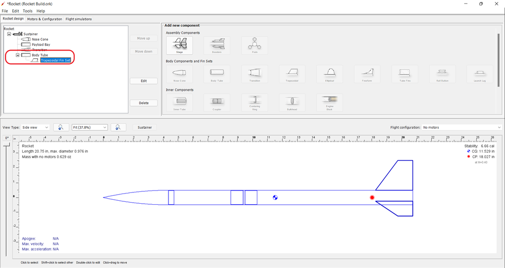
Fins attach to another component, in this case the Body Tube. As circled below, the fins are shown underneath the Body Tube on the component tree.
| Fins Added |
|---|
Adding a Launch Guide
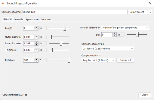
OpenRocket includes two styles of launch guides, Rail Buttons and a Launch Lug. Because of the diameter of the body tube, a Launch Lug will be used for this design. As with fins, launch guides attach to another component, in this case the body tube.
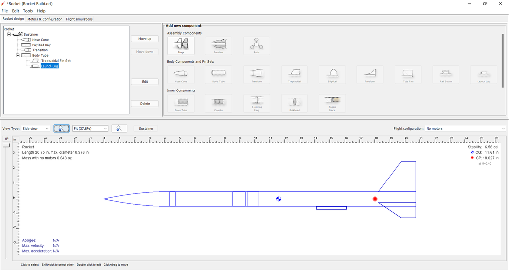
You should now be able to open the Launch Lug configuration window without assistance. So, open your Launch Lug configuration window, and change the specifications to match those shown below.
| Launch Lug Specifications | |
|---|---|
| Launch Lug Added |
Adding Internal Components
Selecting a Parachute and Shock Cord
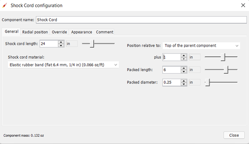
| Adding a Parachute | |
|---|---|
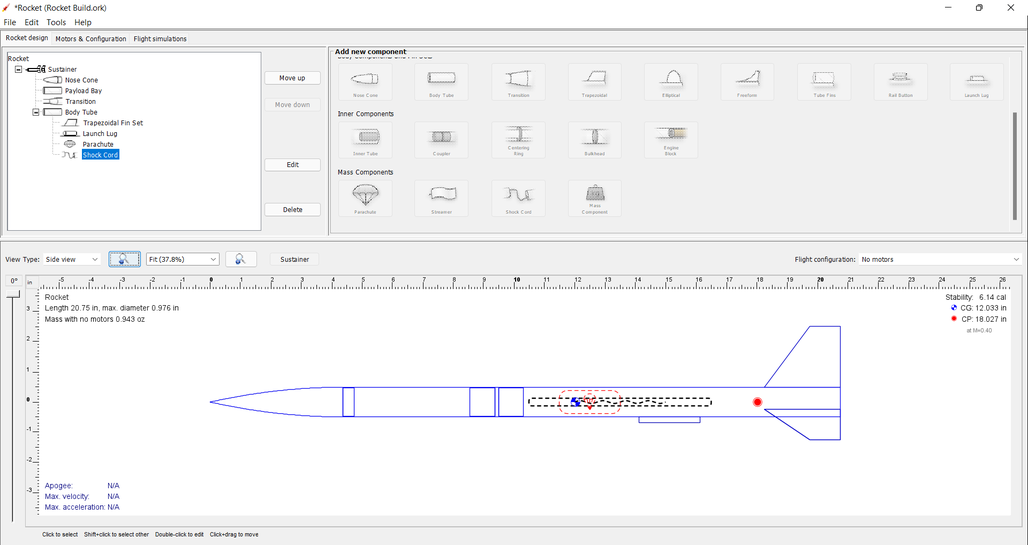
| Adding a Shock Cord | |
| Parachute and Shock Cord Added |
Selecting an Engine Block
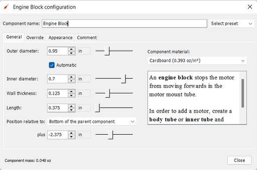
| Adding an Engine Block | |
|---|---|
| Engine Block Added |
← Go to Adding External Components
Viewing Your Design
Basic Views
With the airframe complete, you can view your design in either 2D (as above) or three 3D views. The most commonly used of which are 3D Unfinished and 3D Finished
.
| 3D Unfinished View | |
|---|---|
| 3D Finished View |
Adding Appearance Settings
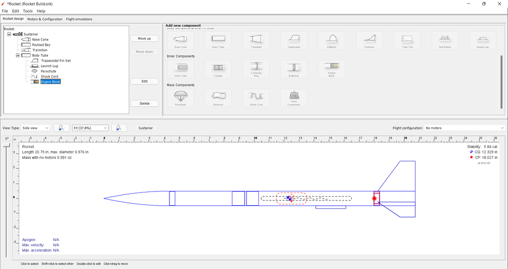
When changing Appearance settings, it is best to be in the 3D Finished pane so that you can see the changes that you are making. So, let's start by changing the view to 3D Finished.
| 3D Finished View |
|---|
Changing Color
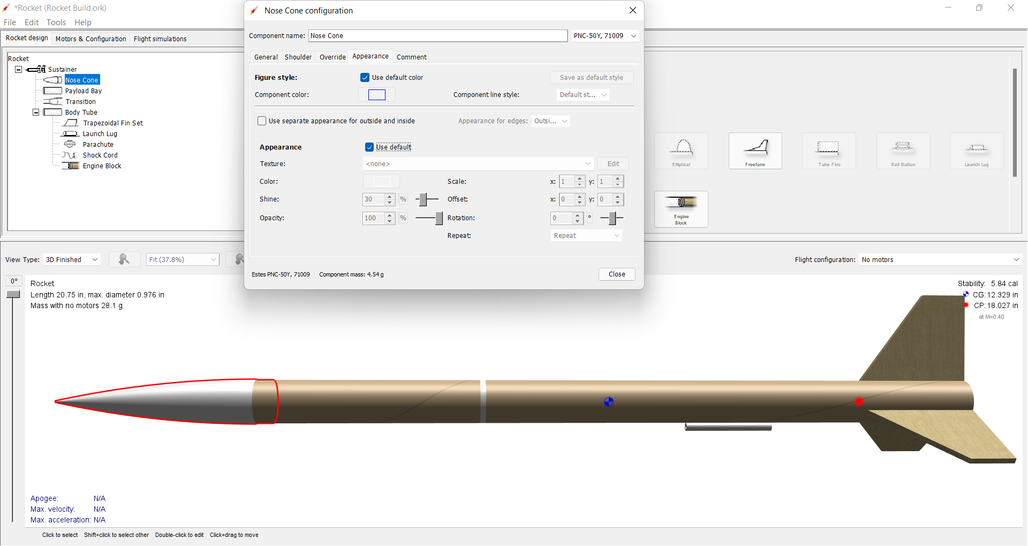
The first change that will be made is to select the color for and change the color of the nose cone. Double-click on the nose cone in the parts tree to open the Nose Cone configuration window, then select the Appearance tab. |
|
| Nose Cone Appearance | |
Now, uncheck the Appearance Use default box. Then, Click on the Color box to open the Chose color window. Select the color of your choice (purple will be used here). Click OK to use your selection, then Close the Nose Cone configuration window. |
|
| Change Nose Cone Color | |
| Nose Cone Color Changed | |
Repeat those steps for the Transition, Body Tube, Trapezoidal Fin Set, and Launch Lug; body tubes, launch lugs, and fins also have a Texture that will need to be set to none. |
|
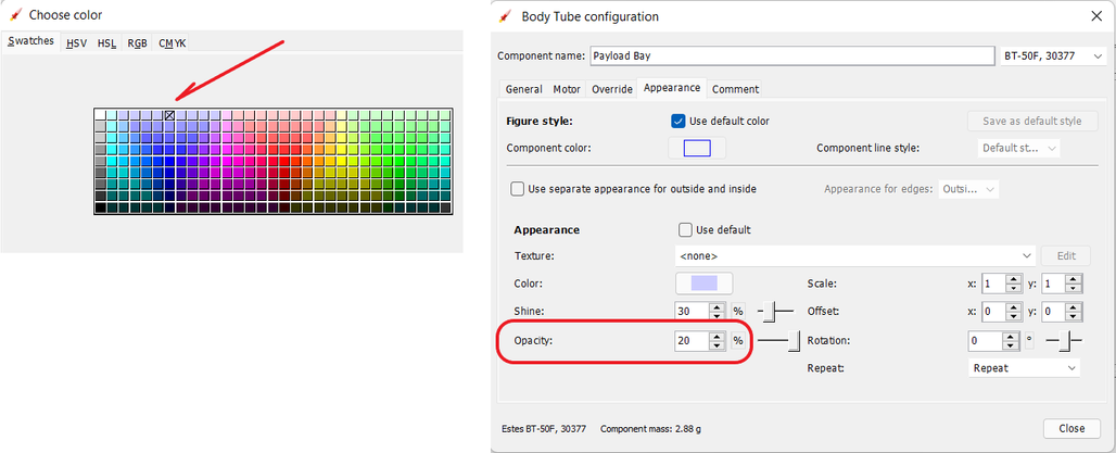
Now for a little magic. Open the Payload Bay appearance tab, uncheck the Appearance Use default box, and set the Texture to none. Then, click on the Color box to open the Choose color window. Click on a light blue color (the box shown with the X below), then click OK. Now, set the Opacity to 20% and close the Payload Bay configuration window, and yoy have a transparent payload bay. |
|
Adding Decals
One last bit of magic, let's apply a decal to the transparent Payload Bay.
But, before beginning, save this image to your device.
| Decal | With the decal saved to your device, you're ready to start. |
|---|---|
| Select Decal from File | Open the Payload Bay configuration window and select the Appearance tab. Click on the Texture type to activate the selection drop-down, and select From file.... Now, navigate to where you saved the decal, and select it. |
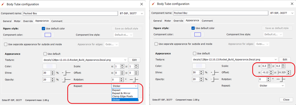
To size and position the decal, first change the Repeat type to Sticker (you only want one symbol on the Payload Bay), then change the "Scale and Offset "x" and "y" values to those shown below. |
|
| Decal Type, Size and Position | |
And, there you have it. A decal on a transparent payload bay.
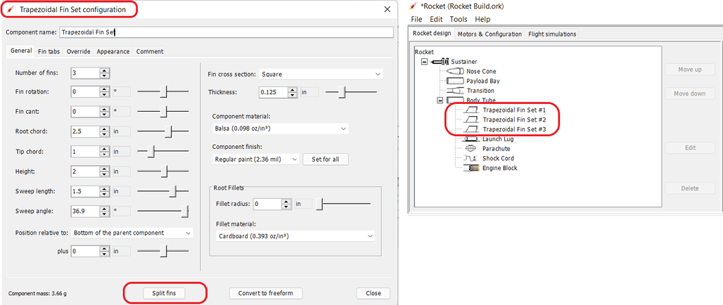
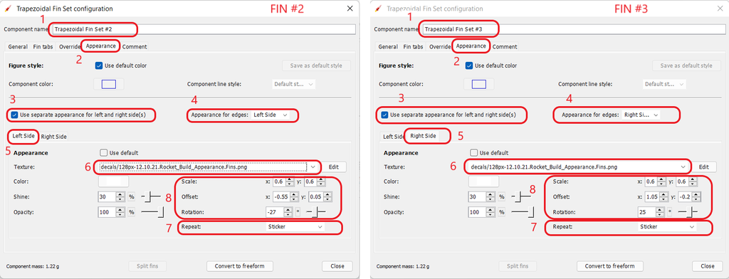
So, let's see what you've learned, and extend your knowledge. See is you can follow the screens below without any instructions.
| Decal | Save this image to your device |
|---|---|
| Split the Fins | After splitting the fins, SAVE AND REOPEN THE DESIGN FILE, then view in 3d Finished. |
| Change Appearance of Fin #2 and Fin #3 | |
Viewing in Photo Studio
So, what will this bird look like in Flight? To really find that out, you need to add a motor first.
Selecting a Motor
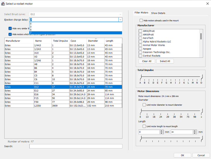
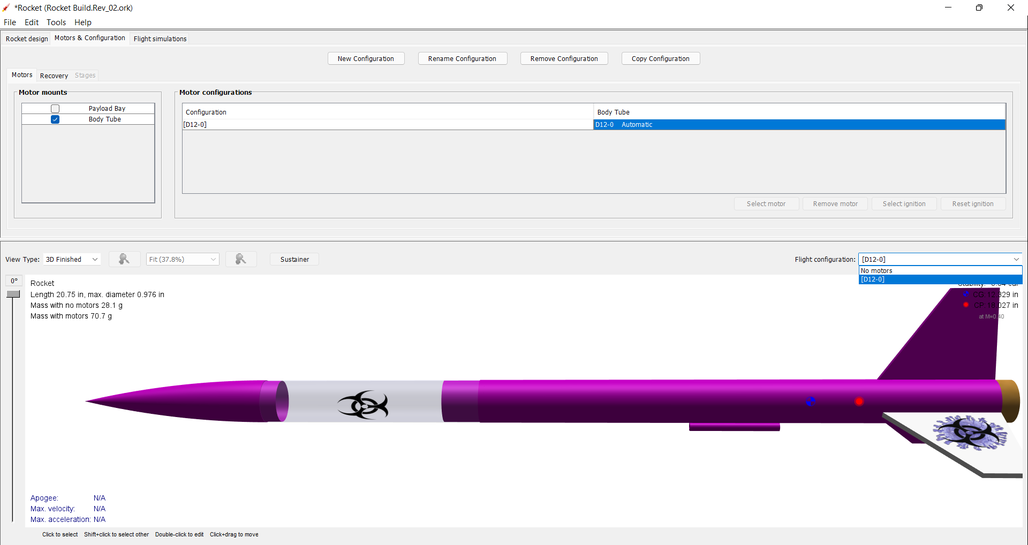
| Motors & Configuration tab | Select the Motors & Confirguration tab, then make sure that the correct motor tube is selected before clicking New Configuration. |
|---|---|
| Select a Rocket Motor | When you select New Configuration, the Select a rocket motor window opens. For this example, select the Estes D-12-7, then click OK. |
| Select Flight Configuration | Now, select the D-12-7 as the Flight Configuration, and you're ready to go to the Photo Studio. |
Flying in Photo Studio
| Open Photo Studio | Are you ready to see your rocket fly? The, open Photo Studio. |
|---|---|
| Select a Rocket Motor | Here it is. |
| Flame Effect | So why did you need a motor? Because, you can't create flames without it. |
Now, experiment to your heart's content.
