Common Component Characteristics: Difference between revisions
mNo edit summary |
mNo edit summary |
||
| Line 7: | Line 7: | ||
== Configuring Common Characteristic Components == | == Configuring Common Characteristic Components == | ||
All components have characteristics that you can select from to customize your model. Some characteristics are unique to a specific type of component (whether a body tube is a motor tube for example). Other characteristics may apply to all components (every component has a color for example) This section relates to characteristics that are common to all, or at least the majority of components. | |||
=== Override Settings === | === Override Settings === | ||
| Line 19: | Line 19: | ||
---- | ---- | ||
[[#Configuring Common Characteristic Components| ← Go to | [[#Configuring Common Characteristic Components| ← Go to ''Configuring Common Characteristic Components'']] | ||
---- | ---- | ||
| Line 39: | Line 39: | ||
==== Opacity ==== | ==== Opacity ==== | ||
Opacity is also known as transparency. | |||
<table class="left"> | <table class="left"> | ||
| Line 47: | Line 47: | ||
</tr> | </tr> | ||
<th>Opacity Slider</th> | <th>Opacity Slider</th> | ||
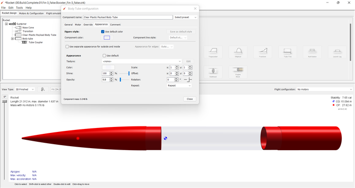
<td | <td>OpenRocket will soon have an opacity slider just below the shine feature on the configuration ''Appearance'' tab. This slider will control the opacity of the component from normal view to invisible. And, this feature gives you a tremendous amount of flexibility when shinning your designs, especially what you can put decals in semi-transparent surfaces.There are a few examples below.</td> | ||
</tr> | </tr> | ||
<tr> | <tr> | ||
<td>Clear Tubes</td> | <td>Clear Tubes</td> | ||
<td>'''[[File:OR.Component.Appearance.Opacity.Transparent_Payload.02.png|left|frameless|720 px | <td>'''[[File:OR.Component.Appearance.Opacity.Transparent_Payload.02.png|left|frameless|720 px]]'''</td> | ||
</tr> | </tr> | ||
<tr> | <tr> | ||
<td></td> | <td></td> | ||
<td | <td>The clear payload is a body tube with a light blue inner and outer color. Then the opacity slider is set to 9.8%.</td> | ||
</tr> | </tr> | ||
<td>Decal</td> | <td>Decal</td> | ||
<td | <td>'''[[File:OR.Component.Appearance.Opacity.Transparent_Payload.03.png|left|frameless|720 px|center]]'''</td> | ||
</tr> | </tr> | ||
<tr> | <tr> | ||
<td></td> | <td></td> | ||
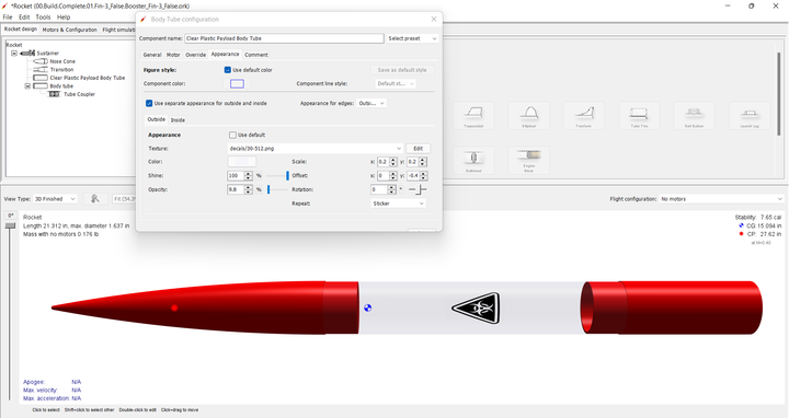
<td | <td>A .png decal with a transparent background can even be placed on a clear payload body tube, or any other surface with reduced opacity.</td> | ||
</tr> | </tr> | ||
</table> | </table> | ||
<br> | <br> | ||
| Line 72: | Line 70: | ||
---- | ---- | ||
[[#Override Settings| ← Go to | [[#Override Settings| ← Go to ''Override Settings'']] | ||
---- | ---- | ||
| Line 78: | Line 76: | ||
=== Comments === | === Comments === | ||
The ''Comments'' tab is common to all components, regardless of class. To demonstrate the use of comments, the ''A simple model rocket'' example included with OpenRocket will be used. First, open the ''A simple model rocket'' example, left-click on the ''Nose cone'' in the component tree to open the ''Nose Cone configuration window'', then left-click on the ''Comments'' tab. | |||
[[File:OR.Components.Tab_Comments.01.png|frameless|720 px]] | [[File:OR.Components.Tab_Comments.01.png|frameless|720 px]] | ||
As you can see, the comments box is empty, as are all of the comments boxes in this example. '''When you create a component in your design, the comments box will, by default, be empty.''' | |||
So let's see how a comment works. In the comments box, type "Ogive shape" and then close the ''Nose Cone configuration window''. Now hover your cursor over the different components in the component tree (except the ''Nose cone''; as you pause over a component, a small pop-up window opens, displaying the name of the component and its mass. But, if you hover over the ''Nose cone'' in the pop-up you see the name and mass of the component on the first line'' '''and''' ''the text entered in the comment box beginning on the second line. And, if you change the component name, the component name change appears in the pop-up as well. | |||
[[File:OR.Components.Tab_Comments.04.png|frameless|1028 px]] | [[File:OR.Components.Tab_Comments.04.png|frameless|1028 px]] | ||
A comment can be used to identify part characteristics, part numbers, vendors, or anything else you want to know about the component without having to open the configuration window, or look in some other source to see. | |||
---- | ---- | ||
[[#Appearance Settings| ← Go to Appearance Settings]] | [[#Appearance Settings| ← Go to ''Appearance Settings'']] | ||
<br> | <br> | ||
Revision as of 22:01, 28 February 2022
Configuring Common Characteristic Components
All components have characteristics that you can select from to customize your model. Some characteristics are unique to a specific type of component (whether a body tube is a motor tube for example). Other characteristics may apply to all components (every component has a color for example) This section relates to characteristics that are common to all, or at least the majority of components.
Override Settings
Mass
Center of Gravity
← Go to Configuring Common Characteristic Components
Appearance Tab → Figure Settings
Color
Component Line Style
Appearance Settings
Texture
Color
Shine
Opacity
Opacity is also known as transparency.
Comments
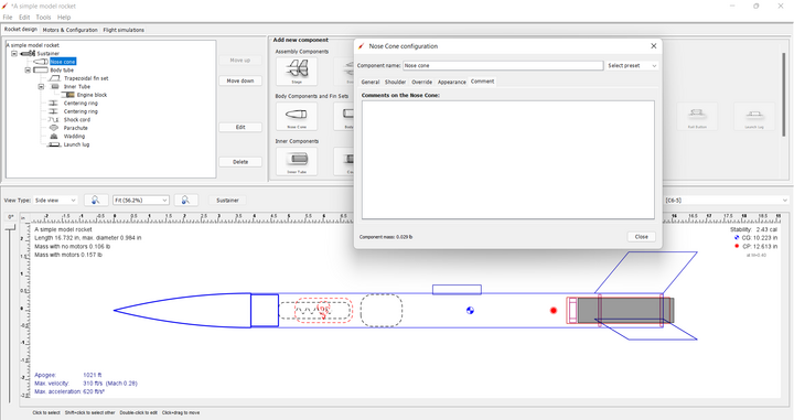
The Comments tab is common to all components, regardless of class. To demonstrate the use of comments, the A simple model rocket example included with OpenRocket will be used. First, open the A simple model rocket example, left-click on the Nose cone in the component tree to open the Nose Cone configuration window, then left-click on the Comments tab.
As you can see, the comments box is empty, as are all of the comments boxes in this example. When you create a component in your design, the comments box will, by default, be empty.
So let's see how a comment works. In the comments box, type "Ogive shape" and then close the Nose Cone configuration window. Now hover your cursor over the different components in the component tree (except the Nose cone; as you pause over a component, a small pop-up window opens, displaying the name of the component and its mass. But, if you hover over the Nose cone in the pop-up you see the name and mass of the component on the first line and the text entered in the comment box beginning on the second line. And, if you change the component name, the component name change appears in the pop-up as well.
A comment can be used to identify part characteristics, part numbers, vendors, or anything else you want to know about the component without having to open the configuration window, or look in some other source to see.


