Common Component Characteristics: Difference between revisions
| Line 40: | Line 40: | ||
=== Appearance Tab → Figure Settings === | === Appearance Tab → Figure Settings === | ||
Figure settings determine how the rocket looks in the side and back views, the default being that outer body components tend to be blue and inner components tend to be red (some solid lines and other dotted). But, OpenRocket allows you to change these defaults to any color and a number of different line styles. | |||
==== Color ==== | ==== Color ==== | ||
==== Component Line Style==== | ==== Component Line Style==== | ||
Revision as of 18:23, 1 March 2022
Configuring Common Characteristic Components
All components have characteristics that you can select from to customize your model. Some characteristics are unique to a specific type of component (whether a body tube is a motor tube for example). Other characteristics may apply to all components (every component has a color for example) This section relates to characteristics that are common to all, or at least the majority of components.
Override Settings
OpenRocket allows you to override several significant flight simulation elements on each individual component, specifically, those related to mass, center of gravity, and the coefficient of drag. Although these settings can be used to make changes to your model to bring it into conformity with measured values, you should only override a value if you have an understanding of how your changes may affect the flight profile of the model. The screenshot below will be used to explain how these overrides are entered.
Mass
Everything that is used to build a rocket has weight, loosely referred to by OpenRocket as mass. Even though there is a global "unit" of measure designation under the preference tab, in configuration windows you can left-click on and change a unit (such as changing grams to ounces) until that window is closed. OpenRocket also uses its own libraries, and your choice of component characteristics to approximate the mass of the component. This estimate is shown in the lower left-hand corner of the component configuration window; if you have overridden the mass value, then that mass value is also displayed there. Changing this value is easy, you just weigh the component and enter the override mass value (a weight symbol will appear by the part in the component tree when you do).
Center of Gravity
The component center of gravity is its physical balancing point. And, as you can temporarily change the mass units, you can also temporarily change the center of gravity units, in the same way the mass units are changed. OpenRocket estimates the center of gravity based upon its library density values and the shape characteristics of the component. But, you can usually readily find the center of gravity by locating where the component balances, and entering that value as the override value (a CG symbol will appear by the part in the component tree when you do).
Coefficient of Drag
INSERT
Override Mass and Center of Gravity of Subcomponents
You may also choose to have the mass and center of gravity of a parent override its subcomponents. (See, 2 above.) What this means is that if a body tube has a parachute, shock cord, centering rings, and motor tube, and you check "Override mass and CG of all subcomponents" and enter a value, then the value you enter overrides not only the body tube, but everything contained within the body tube as well.
← Go to Configuring Common Characteristic Components
Appearance Tab → Figure Settings
Figure settings determine how the rocket looks in the side and back views, the default being that outer body components tend to be blue and inner components tend to be red (some solid lines and other dotted). But, OpenRocket allows you to change these defaults to any color and a number of different line styles.
Color
Component Line Style
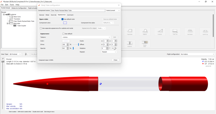
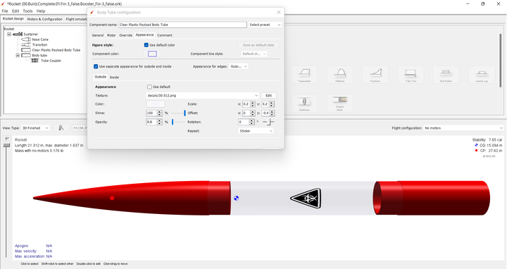
Appearance Settings
Texture
Color
Shine
Opacity
Opacity is also known as transparency.
Comments
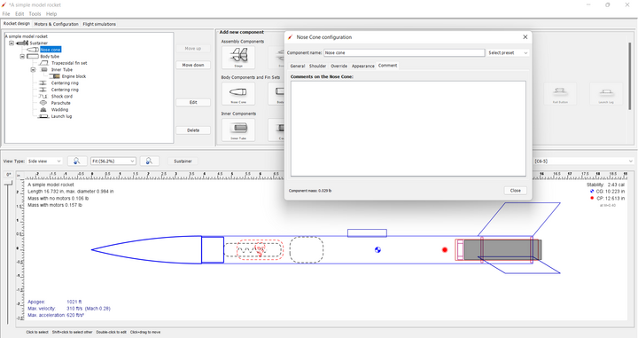
The Comments tab is common to all components, regardless of class. To demonstrate the use of comments, the A simple model rocket example included with OpenRocket will be used. First, open the A simple model rocket example, left-click on the Nose cone in the component tree to open the Nose Cone configuration window, then left-click on the Comments tab.
As you can see, the comments box is empty, as are all of the comments boxes in this example. When you create a component in your design, the comments box will, by default, be empty.
So let's see how a comment works. In the comments box, type "Ogive shape" and then close the Nose Cone configuration window. Now hover your cursor over the different components in the component tree (except the Nose cone; as you pause over a component, a small pop-up window opens, displaying the name of the component and its mass. But, if you hover over the Nose cone in the pop-up you see the name and mass of the component on the first line and the text entered in the comment box beginning on the second line. And, if you change the component name, the component name change appears in the pop-up as well.
A comment can be used to identify part characteristics, part numbers, vendors, or anything else you want to know about the component without having to open the configuration window, or look to some other source.


